You launched your website, checked that everything looked good, and then got back to running your business.
Totally normal.
But as time goes on, that once-shiny site starts to get a little… dusty. Maybe a button stops working. Maybe your hours are out of date. Maybe someone told you they tried to fill out your contact form and never heard back.
Sound familiar? You’re not alone.
As a team that offers website maintenance services for businesses of all sizes in nearly every industry, we’ve seen and heard it all. We have fixed broken pages, missing images, cleaned up hacked sites, patched security vulnerabilities, tracked down old website developers, and about any other crazy website story you could imagine. We’ve even brought sites back online after they disappeared completely.
We’ve got good news! Most of these issues are 100% preventable and fixable. Here are the top mistakes we see, and how to keep your website from experiencing one of them.
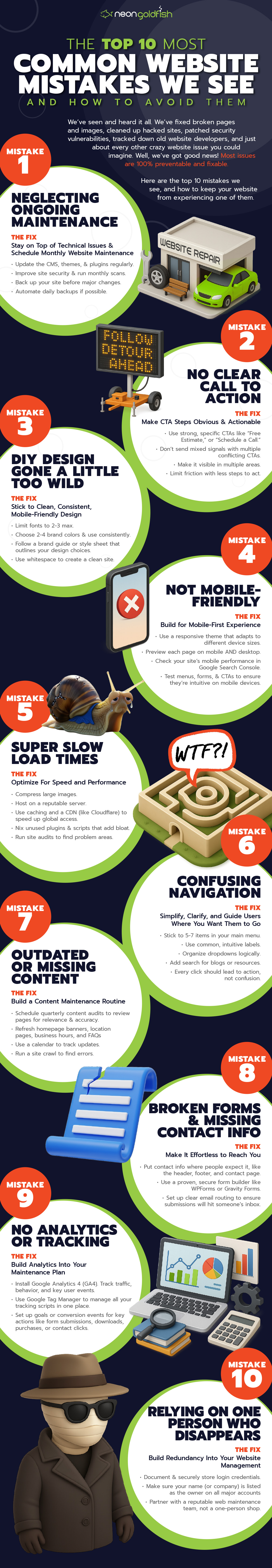
Websites aren’t crockpots. You can’t just set it and forget it. They’re more like cars. Without regular tune-ups, things break down fast and often at the worst possible time.
Too many business owners assume once a site is launched, it’s “done.”
The reality is, websites are living systems that require consistent care. Let things slide too long, and you’ll find yourself dealing with outdated plugins, expired SSL certificates, broken links, slow-loading pages, or forms that mysteriously stop submitting.
And these aren’t quiet little glitches either.
These are the kinds of problems that derail user experience, tank SEO, and scare off potential customers.
A broken form can cost you leads.
A hacked site can destroy your credibility.
A crash during peak business hours? That’s revenue down the drain.
No backup plan means no recovery. We’ve seen businesses lose years of blogs, entire e-commerce product catalogs, or customer data simply because no one was regularly backing up the site.
The Fix: Stay on top of technical issues and schedule monthly website maintenance.
Update your CMS, themes, and plugins regularly.
Improve your site security and run monthly security scans.
Back up your site before any major change. Automate daily backups if possible.
Store backups off-site using services like Dropbox, Google Drive, or BackupBuddy.
Test your backup recovery process to ensure it works when you need it. A basic website maintenance plan should include plugin and CMS updates, backups, uptime monitoring, and quick security checks.
Don’t Get Caught With Your Website Down
Your website works 24/7, until it doesn’t. Download our free Website Maintenance Checklist to spot issues before they become emergencies.
When someone lands on your homepage, what’s the next move?
Should they book a call?
Request a quote?
Buy a product?
Sign up for your email list?
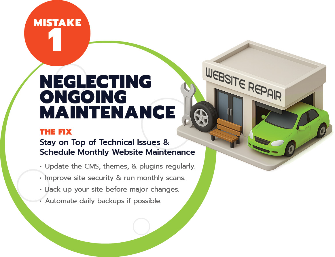
If that next step isn’t crystal clear within seconds, you’re bleeding opportunities. A confusing or absent call to action (CTA) is one of the fastest ways to lose a lead before they even get started.
Too many business websites rely on vague buttons like “Learn More” or “Click Here”, phrases that don’t tell visitors what will actually happen when the click on the button. Others overwhelm users with five different CTAs all competing for attention, or worse, hide the contact form in a dusty corner of the site.
Visitors aren’t going to hang around for long to figure out what you want them to do. If they’re confused, they’ll bounce. And once they’re gone, they’re likely headed to a competitor who makes things simple.
The Fix: Make the Next Step Obvious and Actionable
Every key page on your site should answer the question, “What do I want the user to do here?”
Then build everything around that goal.
Use strong, specific CTAs like “Book Your Free Estimate,” “Start My Trial,” or “Schedule a Call.”
Keep it consistent, don’t send mixed signals with multiple conflicting CTAs.
Make it visible above the fold, in menus, and again at the bottom of the page.
Limit friction. Reduce the number of steps or required fields to make taking action as easy as possible.
Test and refine. Run A/B tests on button copy, color, and placement to improve conversions.
3. The Mistake: DIY Design Gone a Little Too Wild
We love a good Canva moment, but if your website feels more like a chaotic Pinterest board than a polished business tool, it might be time to dial it back.
DIY design is tempting. It’s fast, affordable, and gives you full creative control. But without structure or consistency, it can quickly become messy.
Your website doesn’t need to win design awards, but it does need to be clear, professional, and easy to use. When it’s visually overwhelming or hard to navigate, visitors get frustrated and leave. And worse? They may associate the chaos with how you run your business.
The Fix: Stick to Clean, Consistent, Mobile-Friendly Design
Even without a designer, you can rein in the chaos.
Limit fonts to 2-3 max (one for headings, one for body copy, maybe an accent).
Choose 2-4 brand colors and use them consistently.
Create or follow a brand guide or at least a style sheet that outlines your design choices.
Use whitespace. Don’t try to fill every inch of the screen.
Design should enhance your message, not distract from it.
4. The Mistake: Not Mobile-Friendly
More than half of your visitors are browsing on phones. If your site doesn’t work well on a small screen, you’re essentially telling those users to “Come back later.”
But they won’t.
Today’s users expect seamless mobile experiences. They’re tapping through your site on the go, often with one thumb and limited patience. If they run into tiny text, broken layouts, images that don’t load, or menus that vanish, they won’t waste time troubleshooting. They’ll probably just leave and head straight to your competitor.
And this isn’t just a user experience issue. Google uses mobile usability as a ranking factor, so a clunky mobile experience can hurt your visibility and your credibility.
The Fix: Build for Mobile-First Experience
It’s not enough to look good on mobile. Your site should work effortlessly on it.
Use a responsive theme or page builder that adapts layouts for different devices.
Preview every page on mobile, not just desktop. Most CMS platforms have this built in.
Check your site’s mobile performance in Google Search Console under the Page Experience or Mobile Usability reports for actionable feedback.
Avoid intrusive pop-ups that break the experience or get flagged by browsers.
Test menus, forms, and CTAs to ensure they’re functional and easy to use on a phone or tablet.
Mobile design isn’t optional. It’s the baseline.
5. The Mistake: Slow Load Times
A slow site is a dead site. In today’s world of instant everything, even a few seconds of delay can send your visitors packing.
When was the last time you waited more than five seconds for a page to load? Chances are, you didn’t. You clicked away and found another option. Your potential customers are doing the same.
Page speed isn’t just about convenience. It’s directly tied to user experience, SEO performance, and conversion rates. Every extra second a page takes to load increases bounce rates and decreases the likelihood that a visitor will take action, whether that’s filling out a form, making a purchase, or even sticking around to learn more.
Worse still, search engines like Google take speed seriously. A slow-loading website may rank lower in search results, meaning fewer people find you in the first place. You’re losing at both ends. Fewer visitors arriving, and more of them leaving as soon as they do.
Slow performance often stems from behind-the-scenes issues. Huge image files, unoptimized code, bloated plugins, or low-quality hosting. But to your customers, all they see is a site that feels broken, frustrating, and not worth their time.
The Fix: Optimize For Speed and Performance
You don’t need to be a developer to make speed improvements.
Compress large images using tools like TinyPNG, ImageOptim, or ShortPixel.
Host on a reputable server. Free or bargain-bin hosting is often the bottleneck.
Use caching and a CDN (like Cloudflare) to speed up global access.
Remove unused plugins or scripts that add bloat.
Run performance audits with GTmetrix, PageSpeed Insights, or WebPageTest to find problem areas.
Faster sites mean happier users, better rankings, and more conversions. It’s worth the effort.
Hosting That Doesn’t Ghost You
Tired of outages, slowdowns, or tech support that disappears? We host your site on fast, reliable servers. And get this, we actually answer the phone.
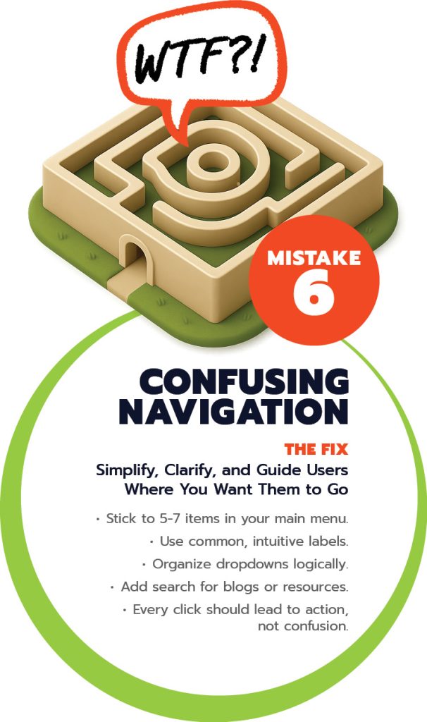
Your website’s navigation is like a store map. If customers can’t find what they need, they won’t hang around. They’ll walk out and shop somewhere else.
Unfortunately, we see this mistake all the time. Cluttered menus with 15+ options, dropdowns three layers deep, or cute-but-vague labels like “Solutions” or “The Experience” when “Services” or “What We Do” would be clearer. It may look clever, but it leaves visitors guessing, and guessing isn’t good for business.
The goal of navigation isn’t to be clever. It’s to be clear.
Visitors should be able to find the most important pages on your site with zero friction. If users have to think too hard, you’ll lose them to a competitor who makes it easy.
The Fix: Simplify, Clarify, and Guide Users Where You Want Them to Go
Time to clean up your navigation.
Stick to 5-7 core items in your main menu (prioritize what matters most).
Use common, intuitive labels like “About,” “Services,” “Contact,” or “Our Work.”
Organize dropdowns logically. Don’t bury key pages three clicks deep.
Add search and breadcrumbs for deeper content like blogs or resources.
Guide visitors to a next step. Every click should lead to action, not confusion.
The easier it is to get around your site, the more likely users are to stay, explore, and convert.
7. The Mistake: Outdated or Missing Content
There’s nothing quite like stumbling onto a website that still lists its 2022 holiday hours. It’s a surefire way to make visitors wonder if you’re still in business.
Outdated or missing content sends all the wrong signals. It suggests neglect, inconsistency, and disorganization, none of which inspire trust.
And it doesn’t just hurt the user experience.
Stale content can drag down your search rankings and reduce your credibility in the eyes of both Google and your audience.
On the flip side, we also see sites with big content gaps.
No FAQs, vague service descriptions, missing location info, or absent pricing. Without this essential content, potential customers are left with more questions than answers.
That hesitation? It costs you conversions.
The Fix: Build a Content Maintenance Routine
Fresh, accurate content builds trust and keeps your site relevant.
Schedule quarterly content audits to review every page for relevance and accuracy.
Assign a content owner, someone responsible for keeping info up to date.
Refresh the essentials regularly:
Homepage banners for seasonal promotions or events
Location pages and business hours
FAQs based on common sales/support questions
Use an editorial calendar in Trello, Asana, or Notion to track updates.
Run a site crawl with a tool like Screaming Frog to identify old content, broken links, and outdated metadata.
Content isn’t one-and-done. Keeping your messaging current is a key part of building long-term trust and improving performance.
8. The Mistake: Broken Forms or Missing Contact Info
Your site is live, your traffic is solid, people are interested… but no one’s reaching out. Why? Because your contact form is broken or buried so deep they can’t even find it.
We’ve seen it all.
Forms that look fine but silently fail to submit. Emails that never arrive because of a misconfigured server. Captchas that block real users.
Or worse, no form at all.
No phone number. No email. No way to get in touch.
It’s one of the easiest things to overlook and one of the most costly mistakes you can make.
The truth is, most visitors won’t go out of their way to troubleshoot. If the form doesn’t work or contact info isn’t immediately visible, they won’t try harder. They’ll leave. That’s a lead you’ll never even know you lost. Multiply that by days or weeks of site traffic, and the impact is significant.
This isn’t just a technical glitch. It’s a customer service failure, a missed revenue opportunity, and a serious credibility hit.
People expect fast, easy communication online, and if you make it difficult, you send the message that responsiveness isn’t a priority.
The Fix: Make It Effortless to Reach You
Strong communication starts with a reliable setup and visible contact options.
Place your contact info where people expect it. The header, footer, and contact page.
Use a proven, secure form builder like WPForms, Gravity Forms, Ninja Forms, or Formspree.
Test your forms regularly, at least once a month, and after any website updates.
Make forms mobile-friendly.
Add confirmation messages or thank-you pages so users know their submission went through.
Set up clear email routing to make sure form submissions actually land in someone’s inbox.
Enable click-to-call and click-to-email links for mobile convenience.
Avoid unnecessary form fields that create friction. Keep it simple and focused
A great website should never make it hard to start a conversation. Make reaching out feel like a no-brainer. You’ll turn more visits into actual leads.
9. The Mistake: No Analytics or Tracking
If you don’t know how people are using your website, how can you make it better?
Unfortunately, this is one of the most common blind spots for small businesses. We often see sites with zero tracking in place.
No Google Analytics, no form submission tracking, no idea where visitors are coming from or what they’re doing once they arrive.
No data. No insights. No direction.
It’s the digital equivalent of running a retail store with the lights off. You don’t know how many people walk in, what they look at, or if they make it to the checkout. Did that promo work? Are visitors getting stuck? Is anyone clicking that big shiny CTA?
Without analytics, you’re just guessing.
If something breaks, a form, a page, a funnel, you won’t know until it’s already cost you leads or revenue.
You can’t fix what you can’t see.
Tracking isn’t just for data nerds. It’s the foundation of smart decision-making. With the right tools in place, you can identify what’s working, spot friction points, and make informed improvements that actually move the needle.
The Fix: Build analytics into your maintenance plan.
Tracking should be part of your monthly workflow, not an afterthought.
Install Google Analytics 4 (GA4). Track traffic, behavior, and key user events.
Use Google Tag Manager to manage all your tracking scripts in one place.
Set up goals or conversion events for key actions like form submissions, downloads, purchases, or contact clicks.
Add heatmaps and session recordings using tools like Hotjar or Microsoft Clarity to see how users interact with your pages.
Track form completion and button clicks to monitor the effectiveness of your CTAs.
Review key performance stats monthly. Traffic sources, bounce rates, time on page, and conversions.
Flag major changes or drop-offs so you can act quickly if something goes wrong.
Better data means better decisions. And a good website maintenance partner won’t just install the tools. They’ll help you interpret the results and act on what matters.
Tired of Playing Whack-a-Mole With Website Issues?
From broken buttons to outdated plugins, small problems can snowball fast. Our website maintenance services take the guesswork (and stress) out of keeping your site healthy, secure, and up to speed.
10. The Mistake: Relying on One Person Who Disappears
“Our old web guy disappeared.”
We hear this all the time.
Perhaps your site was built years ago by a solo freelancer, or a friend-of-a-friend who assisted you on the side. Regardless, they’ve now disappeared, leaving you stranded with no replies, no handoff, and no documentation.
It’s not just inconvenient. It’s a ticking time bomb.
When you rely on one person, you risk losing access to critical systems like your website hosting, CMS, analytics reporting, or domain. We’ve seen business owners locked out of their own websites completely unable to make edits, restore functionality, or even renew their domain name before it expires.
This isn’t just a tech problem, it’s a trust problem. And it leads to real stress, lost revenue, and wasted time.
If something breaks, goes offline, or needs to be updated, who do you call? And if that one person isn’t available, what’s your plan B?
The Fix: Build Redundancy Into Your Website Management
You need more than one set of eyes and more than one set of keys to protect your business. Take a smarter approach.
Document and securely store all login credentials. Know your hosting, CMS, domain, analytics, ad platforms, email marketing.
Use shared tools like LastPass or 1Password to give team members access without compromising security.
Make sure your name (or company) is listed as the owner on all major accounts, especially your domain registrar and hosting provider.
Partner with a professional website maintenance team, not just a one-person shop. You’ll benefit from redundancy, institutional knowledge, and better support.
Ask your maintenance provider what happens if someone on their team leaves. A good team has systems in place for seamless transitions.
Review account ownership and access annually. Things change, so make sure you’re still in control.
With the right team and documentation in place, you’ll never be left in the dark. And if your “web guy” goes MIA, it’s no big deal because you’ve got a whole crew who’s got your back.
Invisible Issues: What You Don’t See Can Hurt You
Not all website problems come with flashing red error messages.
Some lurk quietly in the background.
Dragging down your search rankings, scaring off visitors, and leaving your site vulnerable to attacks.
You might not see them, but Google does. So do your users (even if they don’t realize it).
We’re talking about technical and security issues that fly under the radar.
Crawl errors that prevent search engines from indexing your pages
Broken internal links that frustrate visitors and kill SEO value
Security vulnerabilities that hackers look for (and find)
Expired SSL certificates that trigger “Not Secure” warnings
Missing or outdated sitemaps that confuse search engines about your site structure
Left unchecked, these invisible issues compound over time. They make your site harder to find, slower to load, and less trustworthy in the eyes of both humans and search bots.
The good news?
A solid website maintenance plan oversees all of this. It proactively scans for issues, patches holes, and ensures your site stays clean, crawlable, and secure before problems snowball into costly problems.
If your site looks fine but traffic is dropping or leads have slowed down, the problem may not be what you see, it’s what you don’t.
Don’t Let Small Mistakes Turn Into Big Problems
Your website is one of your most valuable marketing tools, but only if it’s working the way it should. Regular website maintenance isn’t just about fixing bugs. It’s about protecting your brand, showing up in search, and giving your visitors a smooth, trustworthy experience that builds credibility and converts leads.
Think of your website like a storefront. If the lights are flickering or the door won’t open, people leave. But when everything works as expected? That’s when your website becomes an engine for real growth.
If you’re making any of the mistakes above, don’t stress. You’re in good company, and we’re here to help you fix them before they cost you more.
Website Maintenance Services That Actually Have Your Back
Your website shouldn’t be a source of stress. It should be a reliable tool that supports your business every day. Not something that breaks when you need it most.
Whether you need a one-time cleanup or long-term maintenance, our website maintenance services are designed to give you peace of mind.
We’re a full U.S.-based team of developers, designers, and content pros who can monitor, update, and support your site.
So you no longer have to worry about downtime, broken forms, or outdated content holding you back.
Maintain Your Website with Website Maintenance Services From Neon Goldfish
The real cost of poor website maintenance isn’t just dollars. It’s lost time, mounting stress, and missed opportunities when issues go unnoticed.
Our job is to make sure your site runs smoothly, loads quickly, ranks well, and stays secure. But we go beyond just keeping things afloat.
We help your website perform.
That means proactive fixes, smarter improvements, and long-term support from a team that answers the phone.
Every business owner makes mistakes. The key is catching them early, before they snowball into something bigger.
Not sure where your site stands? Let’s take a look. No strings. No pressure. Just honest feedback and a clear path forward.
Frequently Asked Questions About Website Maintenance
1. Why does my website need ongoing maintenance? Regular website maintenance keeps your site fast, secure, and reliable for visitors. Without updates, you risk outdated plugins, broken links, expired SSL certificates, and security vulnerabilities.
2. How often should I update my website? At a minimum, you should perform monthly website maintenance tasks like plugin updates, backups, and security scans. Content should be reviewed quarterly for accuracy. High-traffic or e-commerce sites often benefit from weekly updates.
3. What happens if I ignore website maintenance? Neglecting your website can lead to slow load times, broken forms, outdated content, and even hacked sites. These issues drive visitors away, damage SEO rankings, and cost your business lost leads or revenue.
4. How do I know if my website is secure? You can check if your SSL certificate is active, run malware scans, and review update logs for plugins and themes. However, most business owners partner with a website maintenance service provider who monitors security 24/7 to prevent downtime and breaches.
5. What’s the easiest way to speed up my website? Improving speed starts with compressing images, using quality hosting, and cleaning up unnecessary plugins or code. Tools like GTmetrix or Google PageSpeed Insights can help identify specific fixes. A maintenance partner can take care of technical optimization for you.
6. Can outdated content really hurt my business? Yes. Outdated hours, missing services, or old promotions send the wrong message to visitors. They make your business look inactive and hurt trust. Fresh content also helps with SEO, so you should check for outdated content at minimum yearly, but best practice is quarterly.
7. What if my web designer or developer disappears? It’s a common problem. If you rely on one person, you risk losing access to your website. A professional website maintenance team documents logins, secures ownership of hosting and domains, and makes sure you’re never locked out of your own website.
8. How do I choose the right website maintenance service? Look for a provider that offers proactive monitoring, backups, security checks, content updates, and real support when something breaks. Ask if they’re U.S.-based, if they answer the phone, and how quickly they respond to issues.
Subscribe to Fishbowl Friday, our weekly marketing news roundup delivered directly to your inbox. Dive into the latest trends with insights from the Neon Goldfish team and stay ahead on key marketing topics every week before you step out the door. Join our free newsletter now!
 The reality is, websites are living systems that require consistent care. Let things slide too long, and you’ll find yourself dealing with outdated plugins, expired SSL certificates, broken links, slow-loading pages, or forms that mysteriously stop submitting.
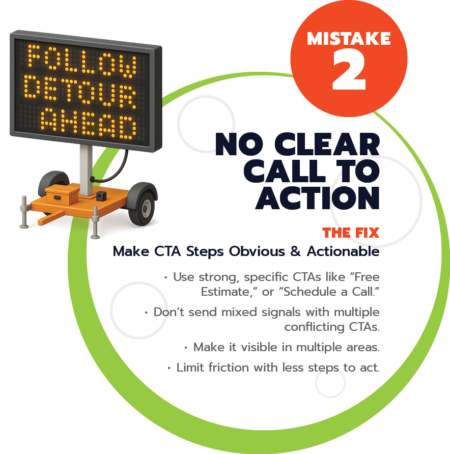
 DIY design is tempting. It’s fast, affordable, and gives you full creative control. But without structure or consistency, it can quickly become messy.
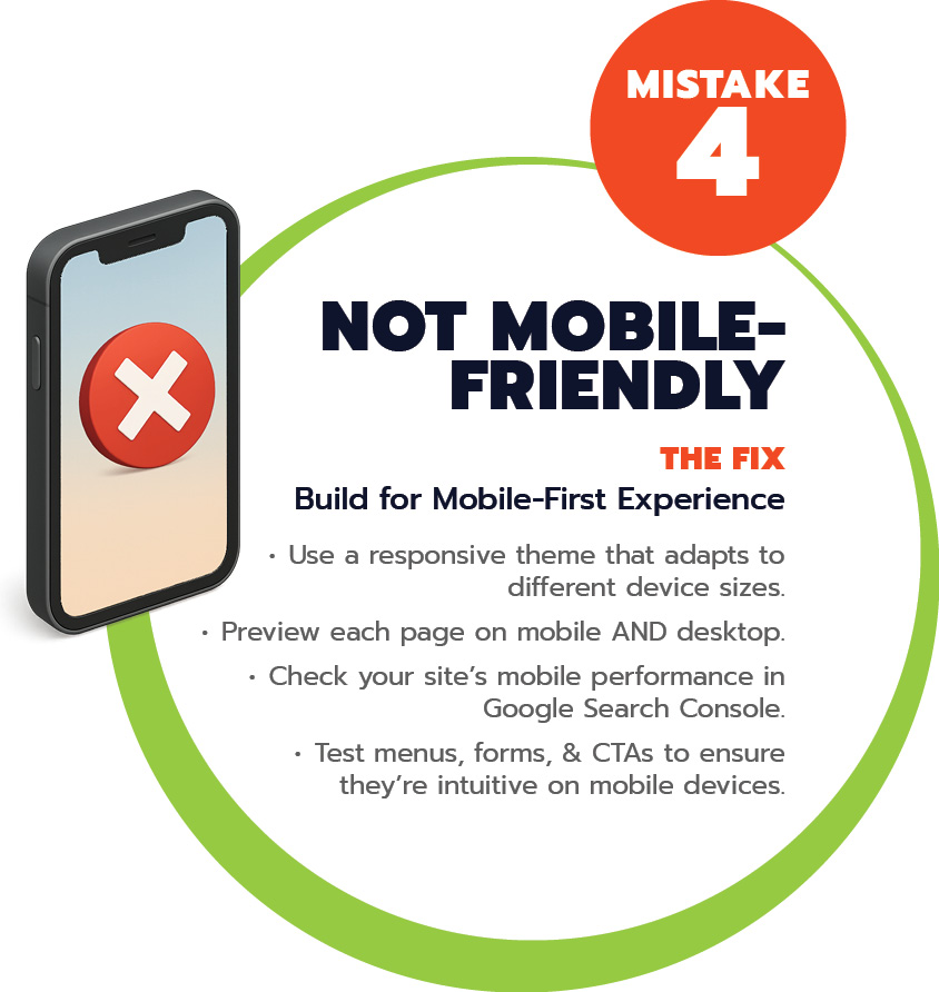 Today’s users expect seamless mobile experiences. They’re tapping through your site on the go, often with one thumb and limited patience. If they run into tiny text, broken layouts, images that don’t load, or menus that vanish, they won’t waste time troubleshooting. They’ll probably just leave and head straight to your competitor.
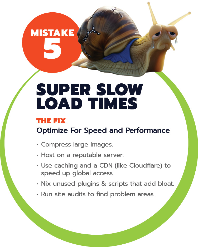
 Unfortunately, we see this mistake all the time. Cluttered menus with 15+ options, dropdowns three layers deep, or cute-but-vague labels like “Solutions” or “The Experience” when “Services” or “What We Do” would be clearer. It may look clever, but it leaves visitors guessing, and guessing isn’t good for business.
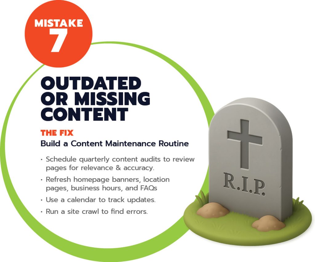 Stale content can drag down your search rankings and reduce your credibility in the eyes of both Google and your audience.
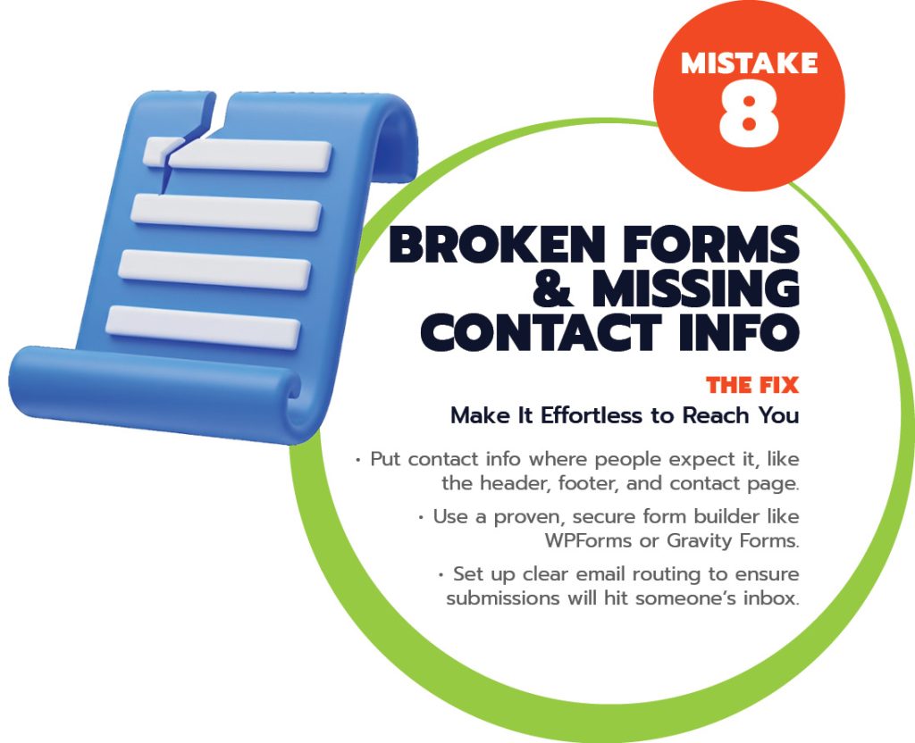 No phone number. No email. No way to get in touch.
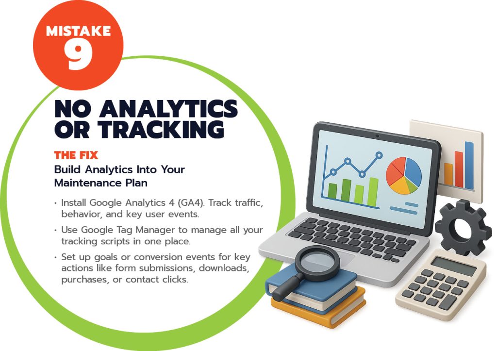 No Google Analytics, no form submission tracking, no idea where visitors are coming from or what they’re doing once they arrive.
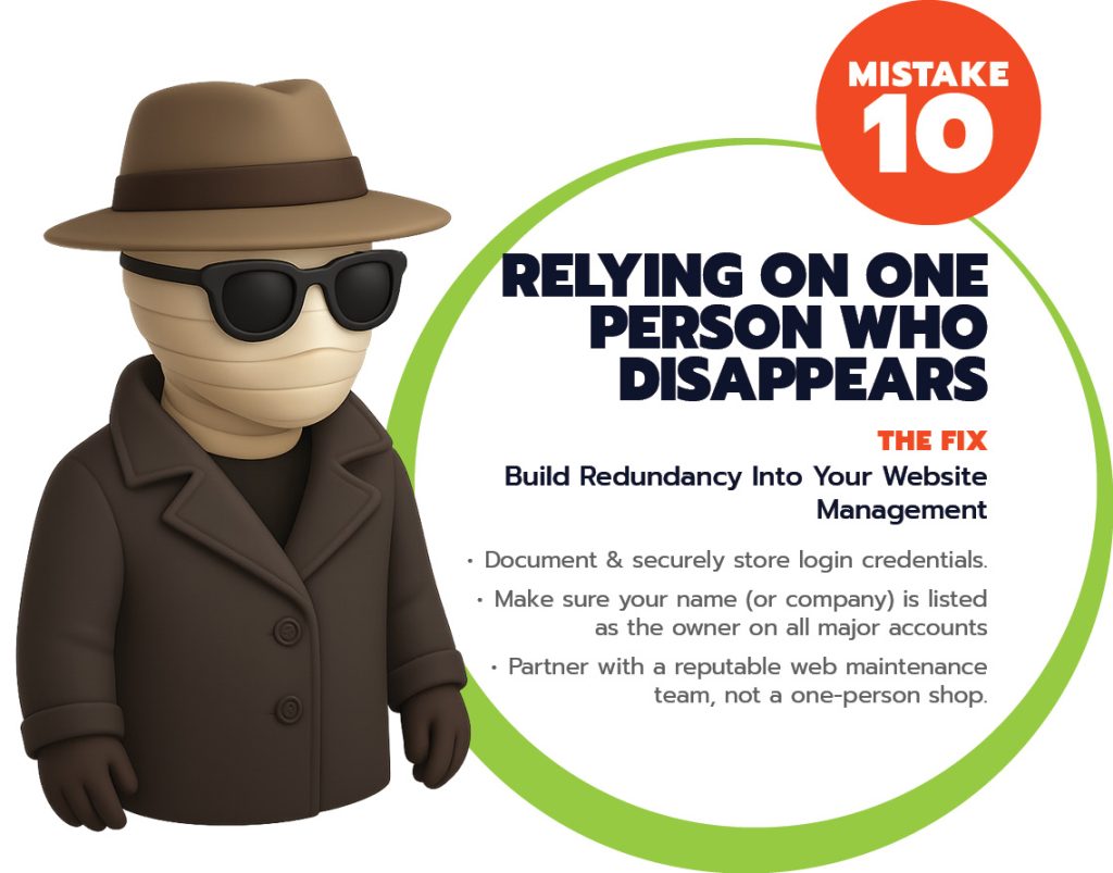 Perhaps your site was built years ago by a solo freelancer, or a friend-of-a-friend who assisted you on the side. Regardless, they’ve now disappeared, leaving you stranded with no replies, no handoff, and no documentation.